Hospital Patient Mobile App
Formative research

PROBLEM
Scheduling and attending doctors appointments can be overwhelming. Navigating confusing hospital buildings, deciphering unclear logistical processes, juggling paperwork, or trying to remember the details of important health information can lead to a poor customer experience.
Our goal was to improve the patient experience. This formative study aimed to evaluate an initial low-fidelity prototype for a hospital app to assess whether it would be usable and useful to patients.
RESEARCH METHODS
We recruited a convenience sample of five people who use or have used professional medical services. And we asked them to complete three main tasks:
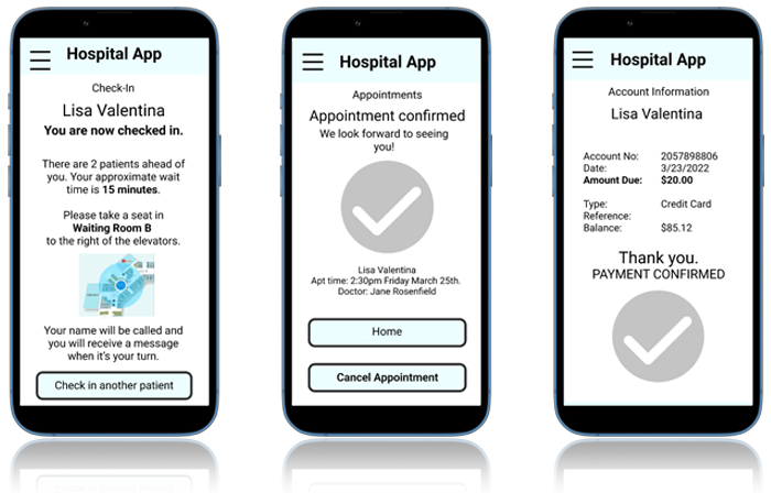
- Make a new appointment
- Check-in
- Make a payment
Our protocol followed a task driven approach using the think aloud method. We made observations of participants during testing and asked for self reported data through post task questions and a post test questionnaire to give us better understanding of each participant's experience.
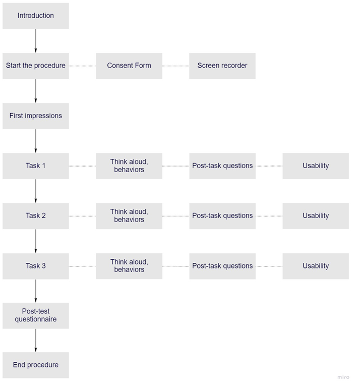
Behavioral data collected:
- Task success
- Task time
- Number of errors
Post-task questionnaire:
- How difficult was it to achieve your goal? - On a Likert scale of 1 to 5, 5 being the most difficult
- How would you describe your experience?
- I noticed you did …. Can you tell me why?
Post-test survey:
- How would you describe your overall experience with this hospital app?
- If you could change one thing in this app, what would it be and why?
- What was the best/worst thing about this app?
- Did you feel it was generally easy to navigate? Please explain briefly.
RESULTS
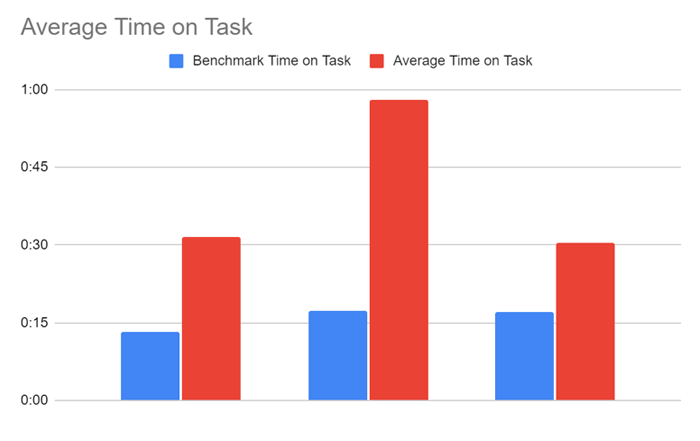
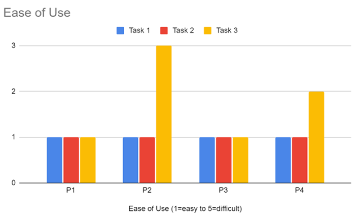
Quantitative results compared task success, time on task, errors, and ease of use across tasks and against benchmarks. Qualitative results were analyzed using affinity mapping and tagging. Positive and negative comments were categorized according to overall user experience, future features, and usability - layout, navigation, terminology.
Task 1:
Participants reported this task as intuitive and easy.
Task 2:
Users reported the second task as intuitive and easy. They loved the map feature and the wait time estimate.
One user reported feeling confused by the lack of clarity making a payment. We noted that the average time on task for this task was much higher than our benchmark time.
Task 3:
Participants reported the task as intuitive and easy. One stated: “The hamburger menu made it easy to go back home.”
We noted that there was uncertainty completing the task. Also, the balance due on the account was unclear. The self-reported ease-of-use metric was higher (more difficult) for this task as well.
INSIGHTS
Overall user experience was described as useful, satisfying, easy, and intuitive. Simplicity should be kept even if features are added as development progresses. We identified these areas for improvement:
- Navigation (Path to payment): P1, P2, and P3 showed hesitation when proceeding to payment. We need to explore placement of the payment button or show a popup message after appointments for guidance. Alternate terminology could also be tested.
- Content (Payment process): There needs to be more clear and detailed information surrounding patient account balances and charges.
- Ease of Use (Check in): All participants reported the task as easy, but it took longer than our benchmark time. In further development, we can improve the size, color, and spacing of the text to make it easier to read and comprehend.
Based off of participant feedback, future iterations of the prototype could include the following:
- Offer an option for asking the doctor follow-up questions after appointments.
- Account balance can include an itemized list of charges.
- Create a clearer process for payment so customers do not feel confused.
KIDS IN TECH
Research and website redesign to increase engagement
MAP THE MONEY MAZE
Research and design for educational mobile app
BRIX
Research and design for conceptual mobile app